CeX Redesign
OVERVIEW
Project Duration: 15 weeks
Usability testing on the Cex website showed there were things that could be done to improve its usability, customer satisfaction and accessibility which would lead to more traffic and ultimately to more sales.
BACKGROUND
CeX (or as it was known then 'Complete Entertainment Exchange') was founded in 1992 in London and there are now more than 500 stores worldwide. CeX enables customers to buy, sell and exchange mobile phones, games, computers and digital electronics.
PROCESS
Usability testing on the current website was performed with participants in order to discover ‘problem’ areas that could be improved.
4 different metrics (eye tracking, performance, satisfaction and heuristics) were used in order to determine the usability of the website. Once the focus areas were selected, user stories were created and an agile project plan was produced.

USABILITY TESTING
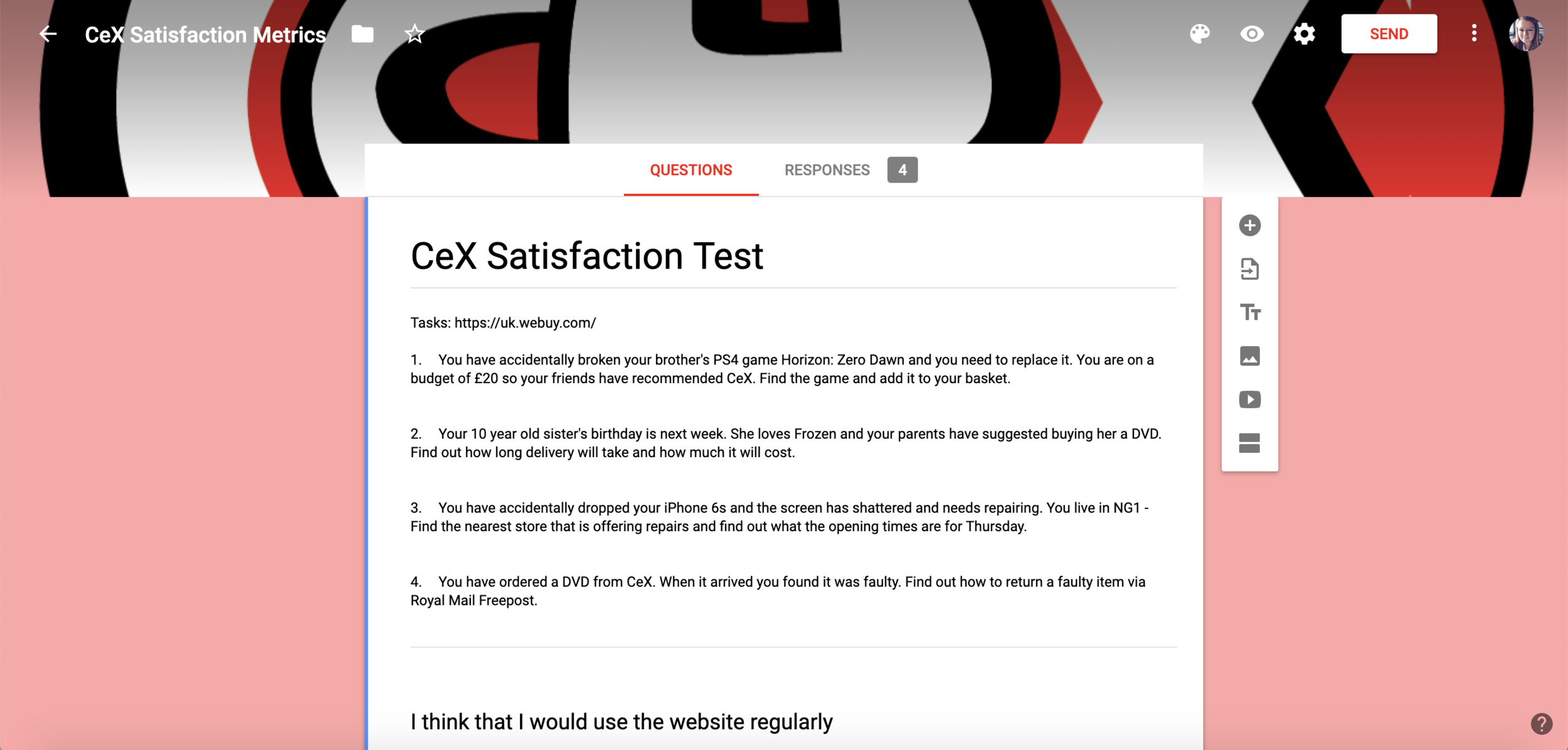
In order to successfully perform the usability testing 4 tasks were designed for the participants to complete for each of the metrics.
The task were:
Buy - Find a specific game and add it to the basket
Delivery - Find out delivery times and costs
Repair - Find the opening hours of the nearest CeX store offering iPhone repairs
Return - Find out how to return a faulty order online using Royal Mail Freepost
Each participant completed the tasks, and the data recorded for analysis.
Eye Tracking
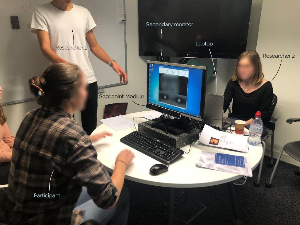
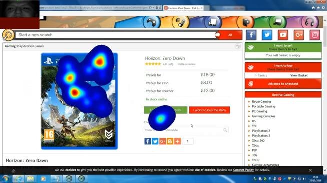
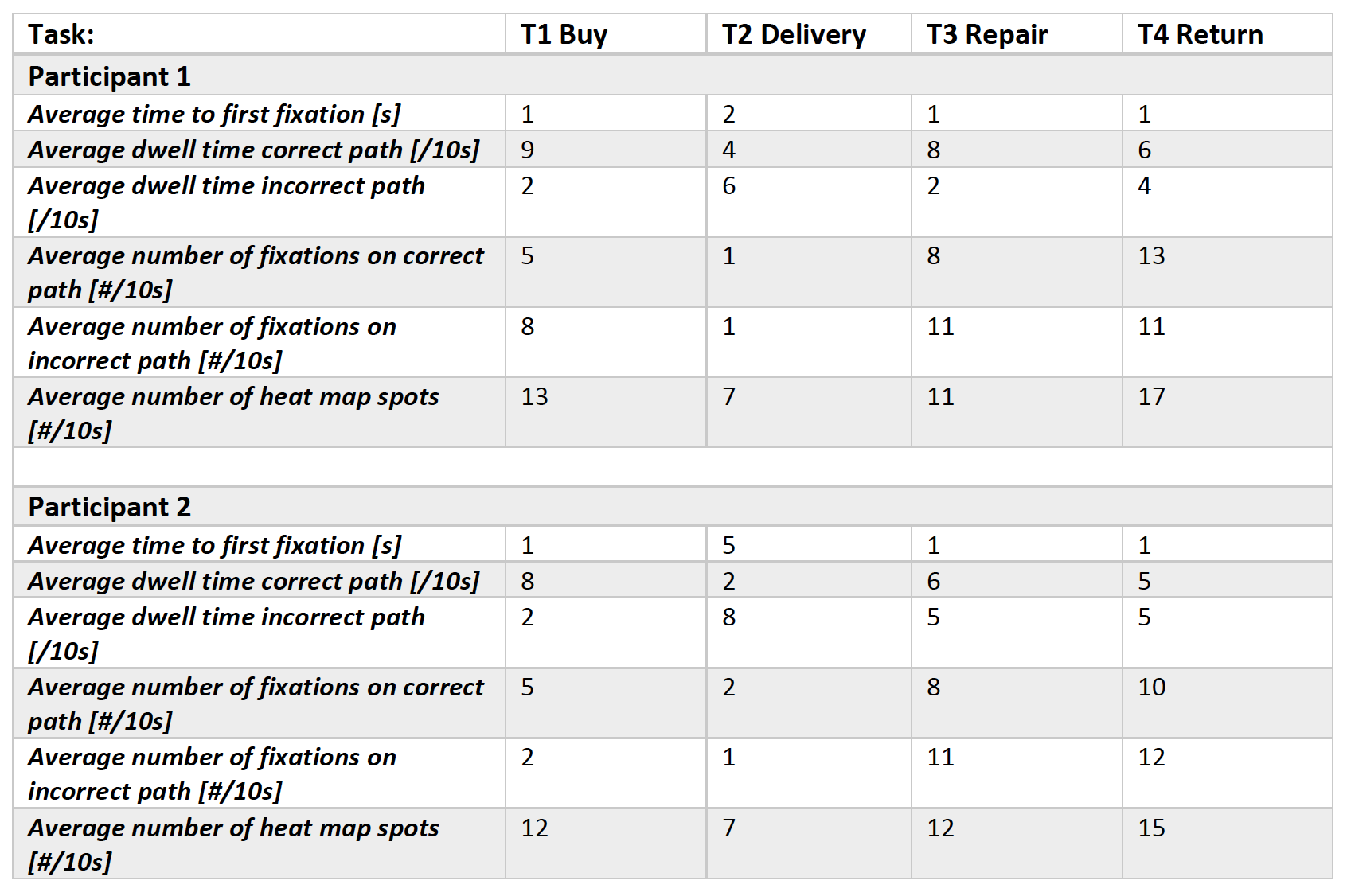
Eye tracking was used on participants in order to find out where on the webpage the user’s eyes are naturally attracted to. It also helped us to see where on the page the user expected the information that they were searching for to be and how many areas they searched before finding the correct path.

Performance Metrics
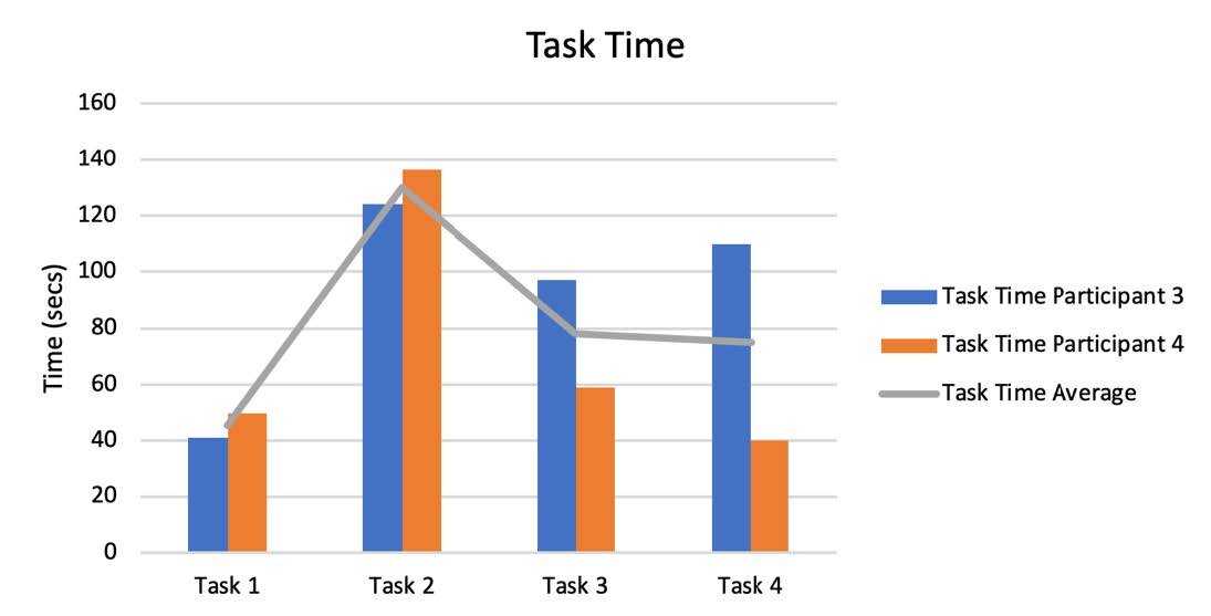
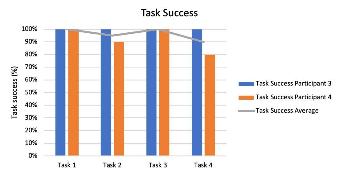
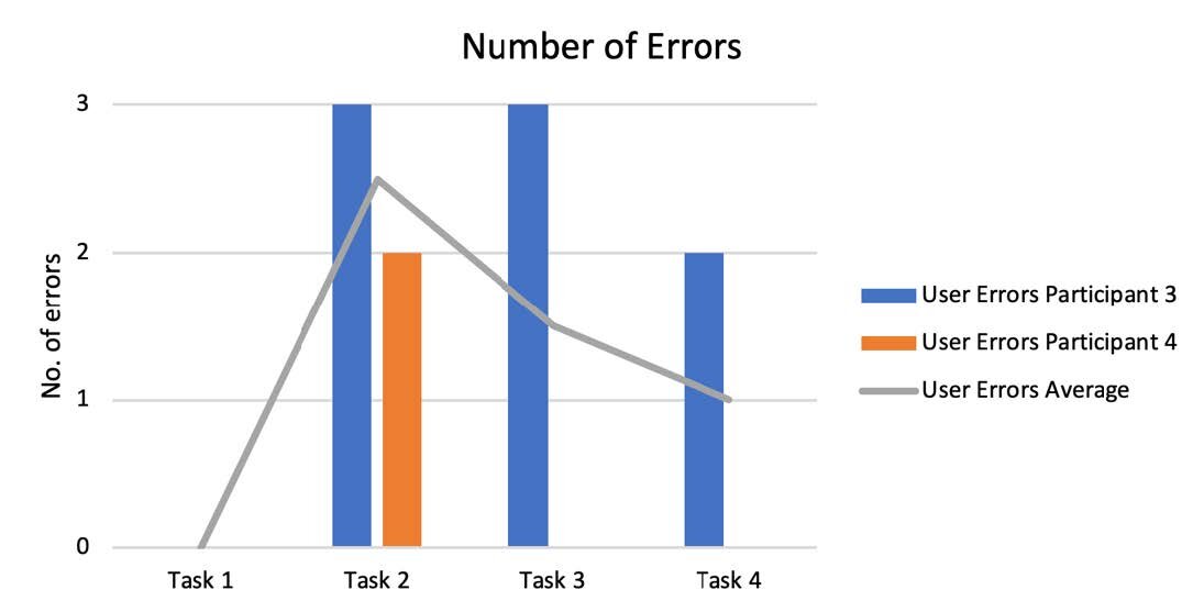
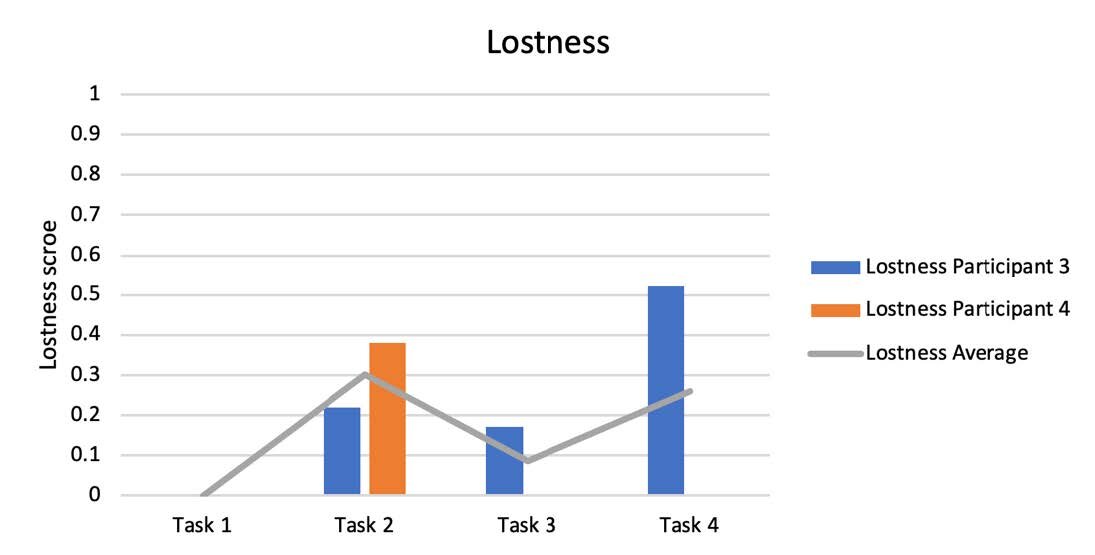
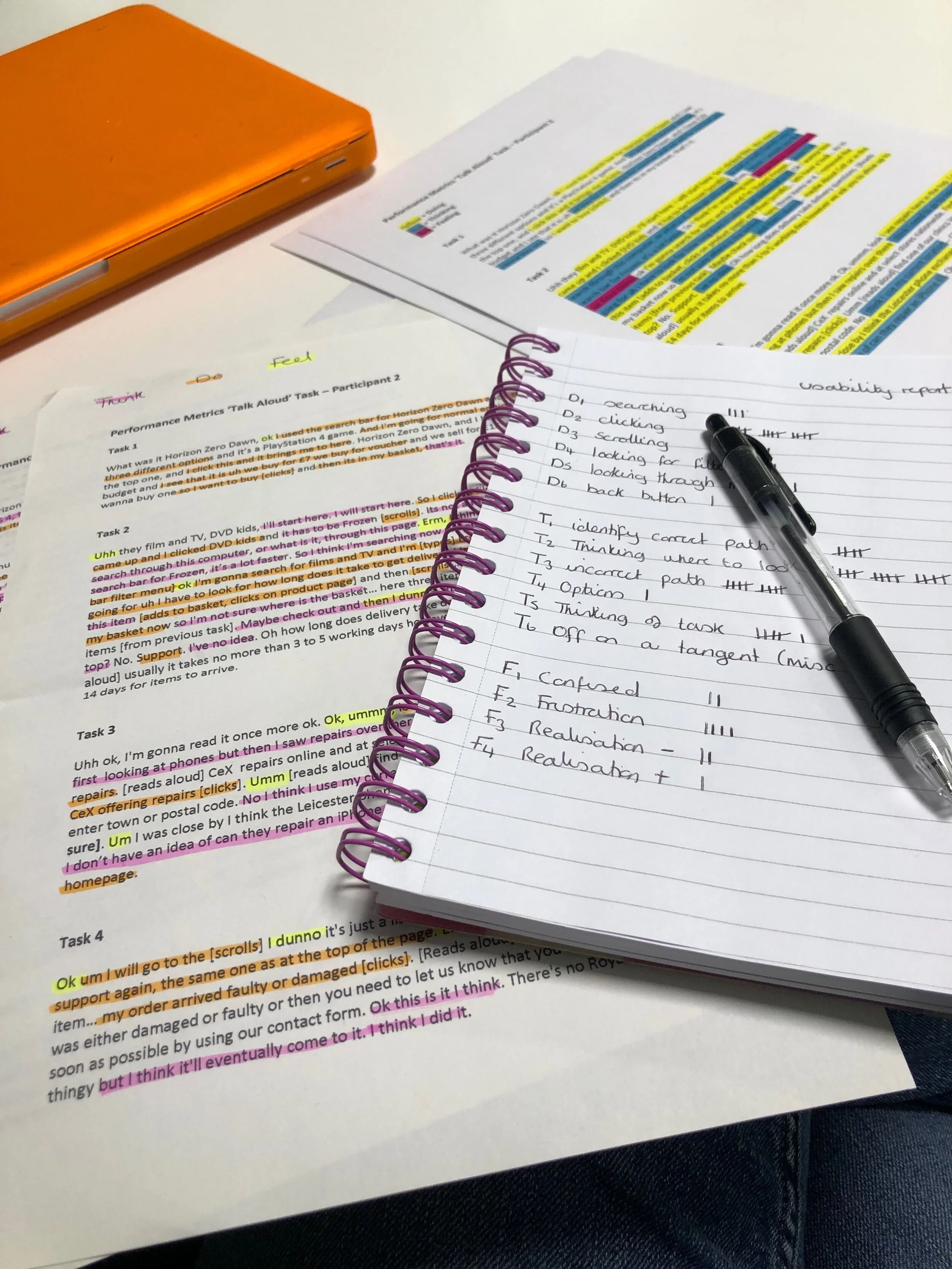
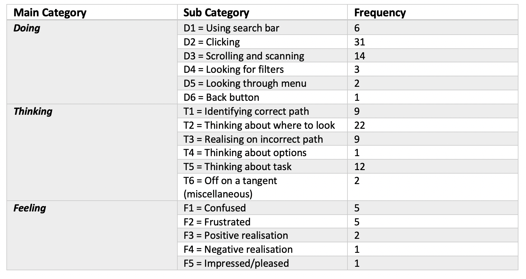
Each participant was asked to ‘think aloud’ during the session in order to get a better sense of what the user was thinking and feeling while they were using the site. This helped to better understand where problem areas are, or where in the journey users were lost or found a different way of completing the task. Each of the transcripts were analysed by 2 members of the team before being compared and agreed upon.
The results are shown in the following graphs and tables.
Satisfaction Metrics
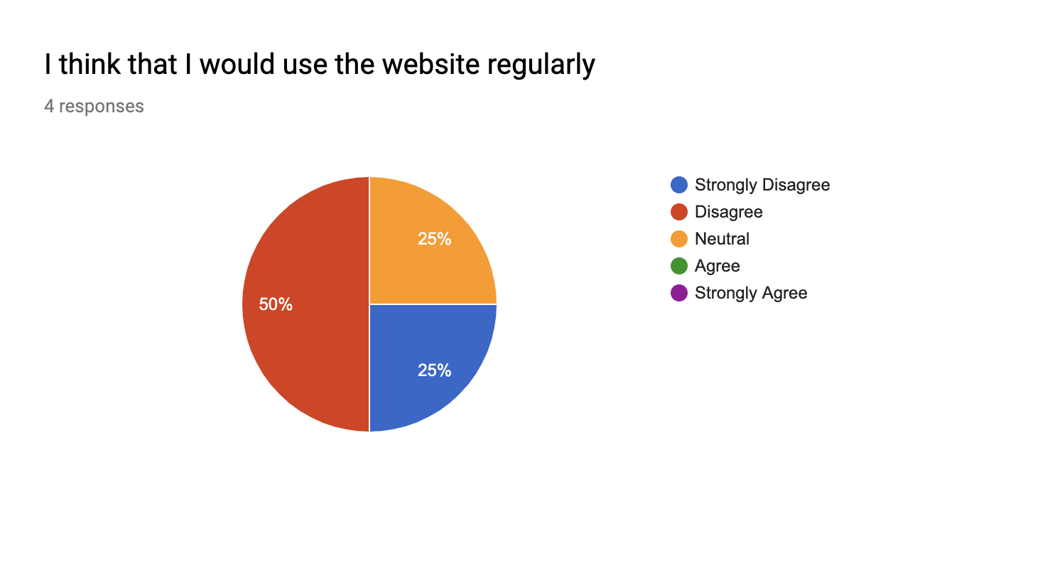
A satisfaction test was given to each participant in order to gather information about what they thought of the website and how satisfied overall with the website and how easy they found it to use.

Heuristics
During a heuristic evaluation of the webpages that were part of each task there were a number of positive and negative attributes
Negative issues:
Viewing and managing items in your basket
Two main menu bars with differing styles
Support is hard to locate
Too much content/colours/styles in one page
Too many prices on the product page
Banner ads showing unnecessary/unimportant content
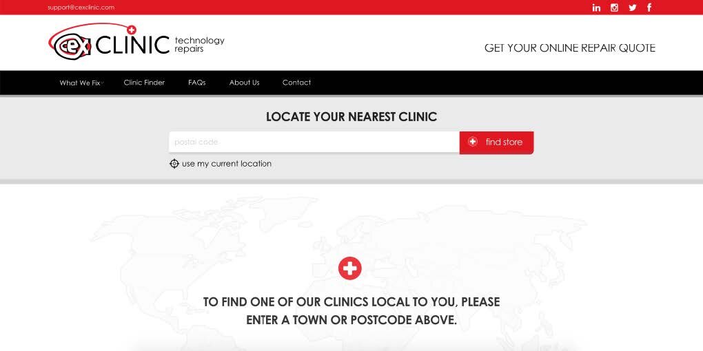
CeX repairs is a separate website and visually looks quite different
Side bar is rarely used, and filter doesn’t perform as expected
Positive points:
Obvious search bar on main pages
Icons are familiar (though there are a few too many of them)
Search bar in support page performs well (but it is a different style)

ACCESSIBILITY
There were several accessibility issues found during the usability study. A key accessibility principle is to allow users to tab through a page using a keyboard which is essential for users to navigate the page without using a mouse. However, the CeX website has an inconsistent tab function, some pages display a focus when tabbing through however in some cases it breaks the design.
Keyboard navigation on the support page
Design breaks when tabbing through the webpage
Colour is also an accessibility issue, Colour Blind Awareness states that in Britain there are around 3 million people who are colour blind, most of which are male. While colour is not used as the only signifier of information it is employed heavily and is used to differentiate between buying and selling options. Use of colour also hinders separation of foreground from background in the site header bar as menu and background colours are not distinct for users with protanopia and deutanopia colour blindness. W3c states that “many people with colour blindness do not use any particular tools and rely on a proper design that provides sufficient colour contrast between text and its surrounding background.”
CeX website as viewed by users with protanopia colour blindness
CeX website as viewed by users with deutanopia colour blindness
DESIGN RECOMMENDATIONS
The design recommendations were analysed and decided upon which would have the most effect, and which ones would improve the user’s experience the most. Once these recommendations are developed, the site would be usability tested again and a new set of recommendations would be developed.
Menu structure - inconsistent across site
Menu structure - has an overly broad product men
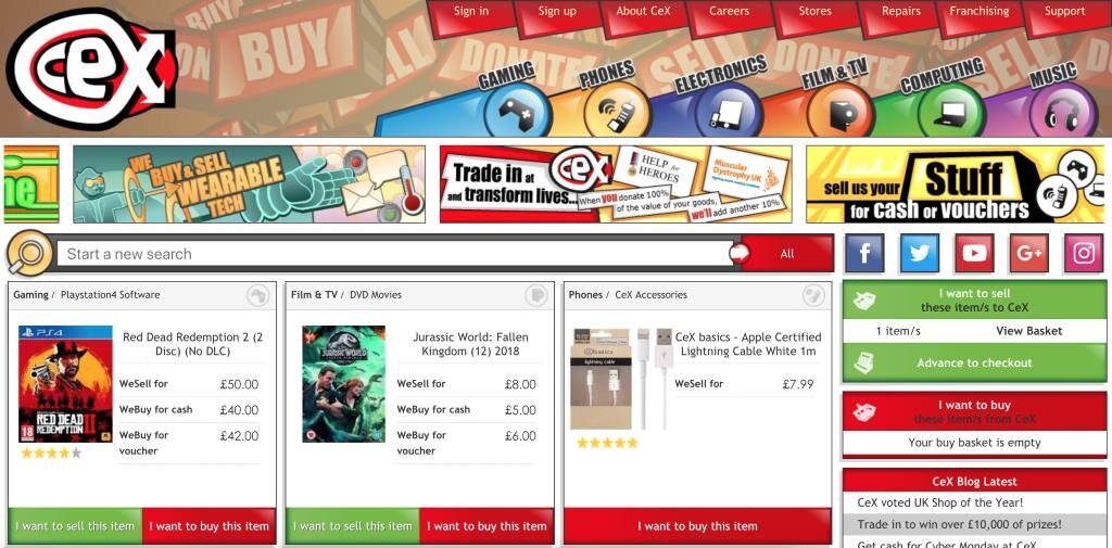
Menu structure - (A) double menus make it hard to find correct information
Basket structure - double baskets are confusing (B)
Basket preview - is insufficient (C)
General - there is too much page content and overwhelming cluttered visual style
AGILE PLAN
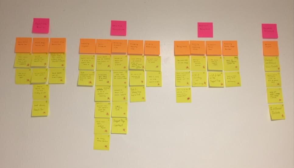
Once the usability testing was completed and analysed, an agile plan was created from the recommendations. User stories were created in order to prioritise the recommendations, and design sprints around them.
A series of 6 sprints was decided upon over a 6 month period, making changes, testing and redeveloping in stages.
WEBSITE REDESIGN
After completing the usability testing, I then took the recommendations and made alterations to the design using prototyping software. The designs were iterated 3 times and tested by the users. Each iteration was usability tested using performance metrics, satisfaction metrics and heuristics. The final iteration of the design was A/B tested with users in order to determine whether the changes made have had a positive or negative effect on the users experience.
The redesign took into account responsive design, which would enable it to be viewed better on different size screens.
The website was redesigned based on a 12 grid system, which reduces to 2 grid system on a phone screen.
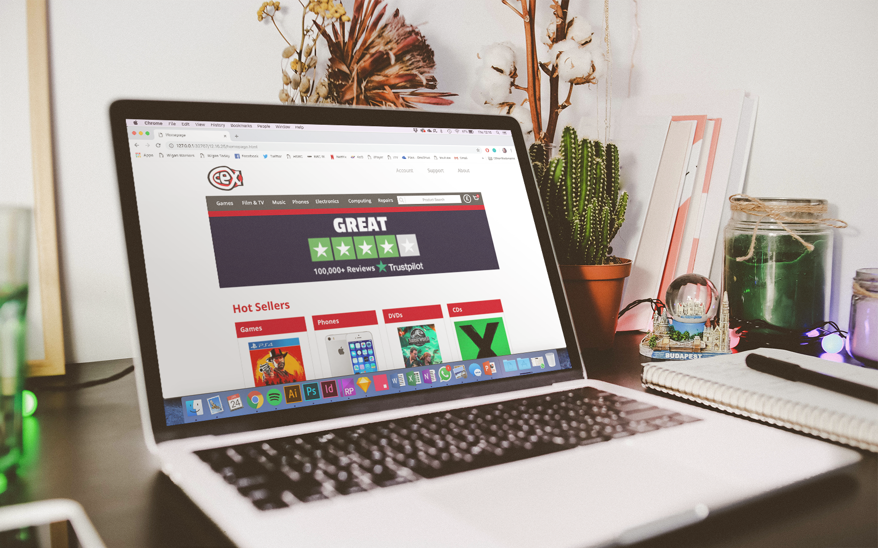
Homepage
Gaming
PS4 page
Product page
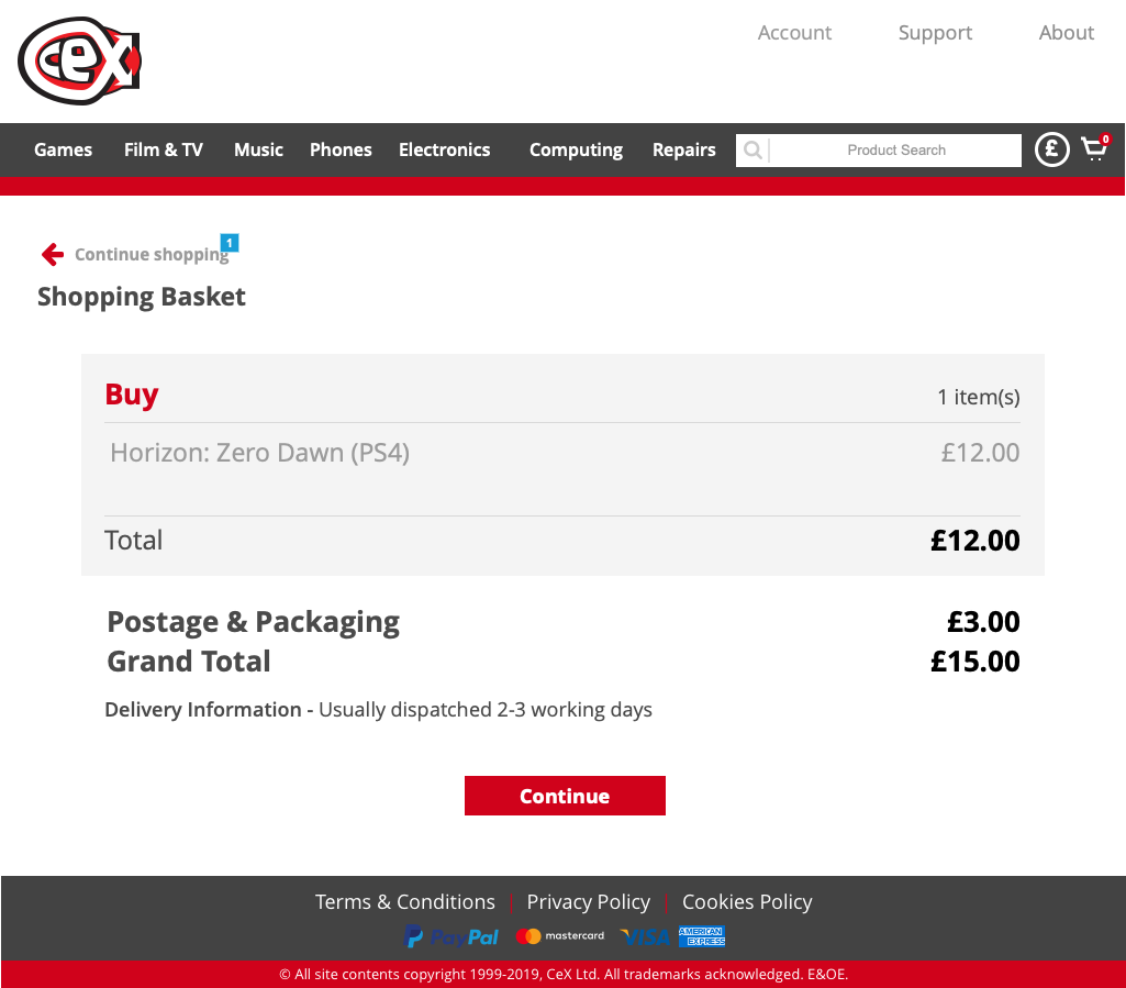
Basket
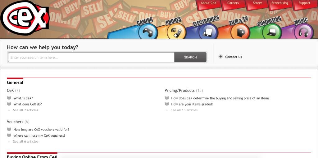
Support Home
Support Search
Support article page


